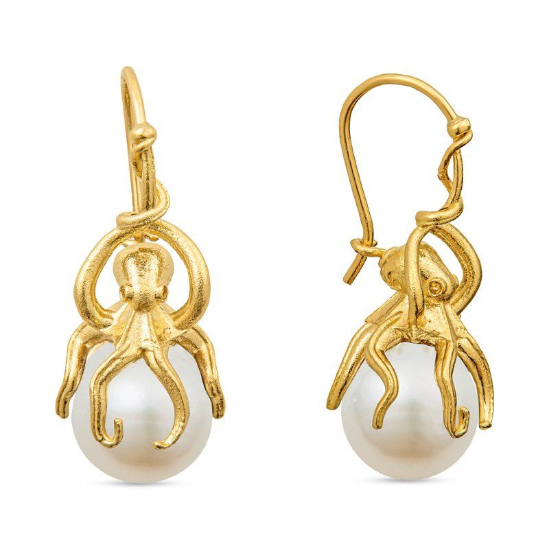
17 Jun, 2018
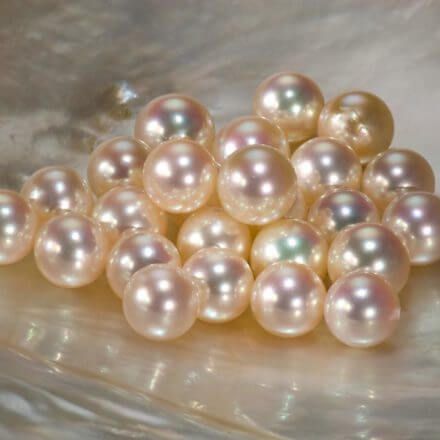
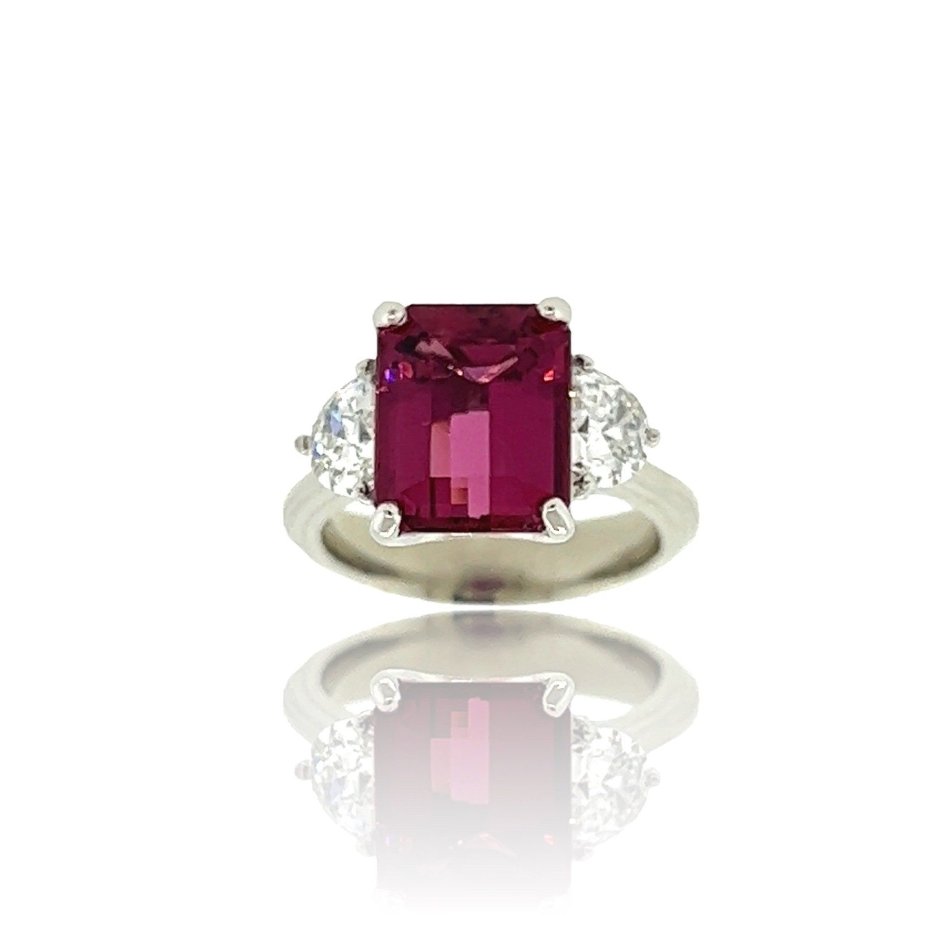
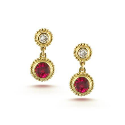
This post is from the Gemological Institute of America’s website, one of the most accurate sources of gemological information available. https://www.gia.edu/ruby-history-lore If you are interested in learning more about gemstones, we recommend checking out this site. (You can ask us anything too!) History of Ruby Red is the color of our most intense emotions—love and anger, passion and fury. It’s associated with objects of power and desire—like fast cars and red roses. Early cultures treasured rubies for their similarity to the redness of the blood that flowed through their veins, and believed that rubies held the power of life. Ruby is one of the most historically significant colored stones. Rubies are mentioned four times in the Bible, in association with attributes like beauty and wisdom. In the ancient language of Sanskrit, ruby is called ratnaraj, or “king of precious stones.” In the first century AD, the Roman scholar Pliny included rubies in his Natural History , describing their hardness and density. Ancient Hindus believed that those who offered fine rubies to the god Krishna were granted rebirth as emperors. Hindus divided ruby into four castes, calling the true Oriental ruby a Brahmin. Someone in possession of a Brahmin was believed to have the advantage of perfect safety. Ruby has accumulated a host of legends over the centuries. People in India believed that rubies enabled their owners to live in peace with their enemies. In Burma (a ruby source since at least 600 AD—now called Myanmar), warriors possessed rubies to make them invincible in battle. However, it wasn’t enough to just wear the rubies. They had to insert them into their flesh and make them part of their bodies. The name ruby comes from the Latin word ruber, which means “red.” The glowing red of ruby suggested an inextinguishable flame burning in the stone, even shining through clothing and able to boil water. Ruby has been called the most precious of the 12 stones created by God. Ruby retained its importance with the birth of the western world and became one of the most sought-after gems of European royalty and the upper classes. Many medieval Europeans wore rubies to guarantee health, wealth, wisdom, and success in love. Desire for ruby is just as great today as it always has been. As a symbol of passion, ruby makes an ideal romantic gift. Consumers are drawn to the lush color because it also signifies wealth and success. Source: GIA.edu


 Leatrice Eiseman, executive director of the Pantone Color Institute, told the press upon release of the news that the choices invoked “a renewed sense of imagination in which color was appearing in a context that was different than the traditional,” that the hues “surround us in nature,” and that they ”evoke a spectrum of emotion and feeling.”